Risky logo change
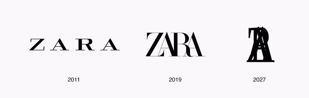
The logo is what represents the brand in the most direct way and defines brand’s visual identity. In the beginning od 2019 Spanish brand ZARA represented its redesigned logo. Nobody hoped that this move will cause a huge amount of reactions among the brand lovers and marketing experts. When the company did the same thing 10 years ago, the change went unnoticed.
The letters in Zara’s new solution are merging with each other, and the comments went that far to make fun of logo by saying it looks like it was designed by robots, not humans, and also there’s a ZABA now written instead of the brand’s name. Social media is full of comments that, following this trend, the logo will eventually become a simple stain thanks to the letters that will totally merge.
Zara is not the first huge brand to have its logo redesigned and had to face the music.
Starbucks changed its logo in 2011 by introducing the one without border text. At that moment the brand was so famous that it didn’t need additional text explanation. In one moment, Starbucks tried to use its original logo for a line of vintage cups, but it provoked a negative reaction from a Christian group for showing a naked siren. We believe they overreacted, but Starbucks has never tried anything similar since that situation.
Reebok provoked costumer outrage by changing their logo after being bought by Adidas. Costumers despised the new logo while forgetting all the bad sides of the old one, as it usually occurs.
The hero of our last story is Instagram. After being bought by Facebook, Instagram got a new logo. The users were disappointed at first, but they soon got over it, and Instagram is still growing.
What’s your opinion on Zara’s new logo?


